Make Your Business Website More Accessible with These Guidelines

Woman in wheelchair on laptop

Guest Writer: Jenny Wise

Every business owner knows how important a well-designed website is when it comes to finding and keeping customers, but many still aren’t aware of how inaccessible their site is to some individuals with disabilities. Ensuring that your company’s website is updated to make a visual and audio impact for everyone is a must, and if you’re unsure of where to start, an accessibility specialist like Travis Lee can help you figure out exactly what is lacking. You can also look for an experienced professional web developer who can take your project to the next level.

Get help from a pro

Once you know what needs to be changed on your website, you may feel overwhelmed at the prospect of putting it all together, or you may not have the technical skills to pull it off. That’s where a professional developer comes in. Not only can they ensure that your site has all the right tech for accessibility across the board, they can also help manage your social media pages or build an accessible app that will allow all of your customers access to you. Check out a job board like Upwork, which can help you connect with web development agencies and gives you access to their ratings and price ranges. Pay special attention to the delivery times, as well, since you’ll want to know when you can expect the project to be finished.


Go for style and function


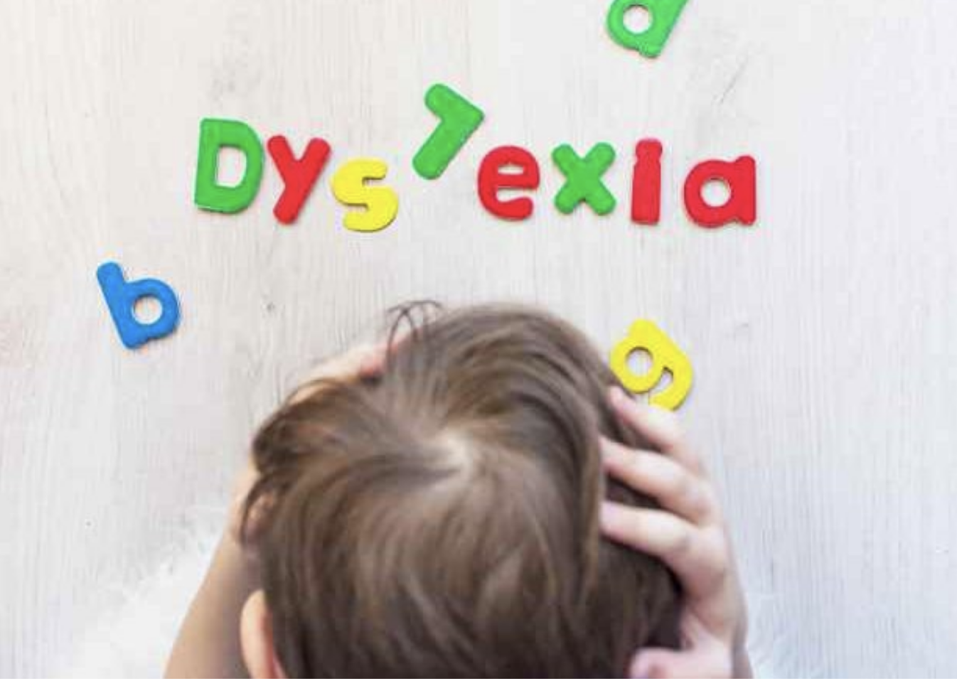
If you’re looking for simple changes you can make yourself, consider things like your business’s blog. Does the content management system you use provide closed captioning on videos? Did you choose the current layout based on visual appeal alone? If so, it’s best to look for headings that look nice but are compatible with screen readers, which are used by individuals with visual impairments to turn text, images, and other aspects of a website into braille or speech. Get familiar with this tool and learn how it works in order to get a better idea of how your blog should be laid out.


Make video content accessible, too


Whether you’re adding videos to your blog, social media account, or the homepage of your site, it’s crucial to remember that this content must be accessible, too. Videos can boost your SEO ranking, and if more customers can find your business online, the content needs to be available for everyone to read or hear. Keep in mind that captioning provides written descriptions for every part of the audio, from music to applause, while subtitles only describe speech, and this difference can be major depending on an individual’s impairment. It’s important to double-check your captions and subtitles for accuracy if they’re provided by a media platform (such as YouTube).


Ensure your content can be accessed anywhere


While ensuring that your website and social media pages are accessible is a top priority, it’s also a good idea to make sure your content can be accessed on a wide variety of devices. Many individuals who are living with a disability or impairment find that using a smartwatch or phone is much easier than using a computer because of the haptic feedback they provide. If your business doesn’t already have an app, now is the perfect time to have one developed. Not only will it assist those customers who are living with a disability, it will make your company more accessible to a wider range of customers, as well.


Ensuring accessibility for all of your customers is essential when you’re running a business, but it doesn’t have to be a stressful process. Take your time learning about the different tools that are used in the impaired community, as this can help you make decisions about your site, blog, or app, and get familiar with the laws and regulations surrounding accessibility standards online.


Contact Travis Lee with your questions regarding site accessibility today.

How to Modify Your Home for a Visually Impaired Toddler

blind child covering eyes

Guest Writer: Amanda Henderson ⎸amanda@safechildren.info

Our children open our hearts in ways we never thought possible. Words simply cannot describe the fulfillment and joy that our children bring into our lives. Of course, parenting isn’t easy. The toddler years can be particularly challenging for any parent. If your toddler is blind or visually impaired, you’ll need to take some extra steps and precautions to ensure your child’s safety, comfort and happiness during those crucial years of life.


Web accessibility specialist Travis Lee explains how both you and your child can survive the “terrible two’s.”


The Truth About Temper Tantrums

First, remember that temper tantrums are often the only way your child knows how to express his or her frustration. Often, your child is simply upset that someone (perhaps even you, the parent) isn’t understanding what she is trying to communicate. Possibly, your child is angry that he isn’t able to independently do something that he wants to do. Whatever the case may be, remind yourself that temper tantrums are simply part of the deal -- and that’s true for all toddlers, not just yours.


When the inevitable temper tantrum happens (trust me, it will) you can manage the temper tantrum just like you would with any other child. Parents magazine suggests remaining calm, don’t show your anger or frustration, and don’t allow yourself to reinforce your child’s bad behaviors.


Start with a Sketch

Figuring out how to rearrange furniture to “childproof” your home can be overwhelming, and the fact that your child has a visual impairment can add complications to an already stressful time in your life. To save yourself some time and effort (not to mention sanity) consider getting out the good old pencil-n-paper and drawing up a sketch of each room in the home.


Sketching the outside is a good idea, too, because you’ll want to be sure to prepare the exterior of your home as well as the interior. Things like smooth sidewalks to prevent tripping and a fence to mark boundaries can boost safety outdoors. If you need a fence installed, finding a qualified contractor has never been easier; simply do an online search for “fence installers near me” and use service directory Angi to read through customer reviews to narrow down your search.


Reducing Clutter
Regardless of whether your child is completely blind or just has a visual impairment such as low vision, Child Safety Center notes that it’s important for your child’s safety to keep the home as clutter-free as possible. There are some simple steps you can take to hopefully reduce the chances of your child slipping, tripping, falling, or otherwise getting hurt. First, move any furniture out of the walking pathways and doorways.

Be Consistent
Avoid the urge to rearrange furniture. Even though it’s nice to redecorate and make our homes more “feng shui,” it can create confusion and risk of injury for our little ones. When items are stored in a consistent location, it makes things easier on your child and might even create more dreaded temper tantrums.


By carefully rearranging your furniture and making some simple, easy home modifications, it is possible to adapt your home for your visually impaired child or toddler. Your child might still be too young to understand the significance of what you’ve done for him or her, but your DIY “home improvements” will enable your child to have more independence, while making your home safer for your little one. While it’s not possible to completely eliminate temper tantrums, these steps might at least reduce some of your child’s frustration and make the toddler years a little bit easier on both of you.


Travis Lee is a web accessibility specialist and instructional designer focused on creating innovative and interactive learning for students of all ages with an emphasis on a simple and engaging user experience. Reach out today! travis.lee@ucop.edu

Take a Shot at Small Business Survival With a Pandemic Plan

Screen Shot 2021-06-17 at 2.52.36 PM.png

By Guest Writer: Amanda Henderson ⎸amanda@safechildren.info

The COVID-19 pandemic has hit many businesses hard and has been particularly unforgiving to the scores of small businesses that serve their communities. In general, larger businesses have more resources than your typical small business, such as greater cash reserves to help get them through business slowdowns and the mandated closures so many experienced.

Even as post-pandemic life allows for more and more re-openings and restrictions are eased, small businesses must continue to be diligent in creating strategies to help them adapt to a landscape scarred by the pandemic’s ruthless march across the globe. Fortunately, there are measures that resilient small business owners can employ at a reasonable cost to remain competitive and afloat as we all try to navigate what our future will look like.

Get Structured

One of the first steps to take when starting up is choosing what type of business you’ll be operating from a legal and organizational viewpoint. Will it be a sole proprietorship or a C corp? Many small businesses go the limited liability company (LLC) route, and for good reason. Personal assets are protected when you operate as an LLC, and less paperwork and tax advantages are attractive to those who run smaller companies. The process can be complex, but it’s possible to have an online formation service like Zenbusiness do most of the work for you, including walking you through the process, providing all the right forms, and eventually file on your behalf.

Take It Home

Businesses need to have a presence where their customers are and, in a stay-at-home and social-distancing reality, that presence has been in customers’ homes. But how does that translate into customer retention and recruitment strategies?

●      Delivery services. Just about any type of physical goods — from food to jewelry — can be delivered to the customer’s doorstep.

●      Pick-up option. Give the customer the option to pick up their purchases by picking them up safely outside of your place of business.

●      Pivot. CNBC notes the importance of giving people what they need now versus what they wanted pre-pandemic. Maybe it’s customized masks that are stylish for work, functional for sports, or playful for children. If you have a service business, find a way to transition that service. If you had a catering business, can you now use your vehicle to provide safe transportation to medical appointments? As a personal trainer, can you create online videos for your clients and customers to access from home? How about a technology consultant who can virtually assist clients in setting up technology apps, such as videoconferencing or telehealth platforms? A salon owner or hairstylist can offer online hair cutting and makeup tutorials. It may take some creative maneuvering, but it keeps you in front of your customer base and demonstrates your determination.

●      Saving strategies. A benefit to telecommuting is saving on office utilities and those little extras like coffee and refreshments. Look for other ways to reduce expenses, even if they are temporary measures.

●      Find a logical, larger partner. Comb your network for a larger business that may be able to offer you a continued distribution channel for your products. Will a local restaurant with a delivery infrastructure in place offer your baked goods as an option, or even a floral arrangement from a florist to add some pandemic cheer to homebound diners?

●      Robust connectivity. Use online networking and social media platforms like never before. Digital Doughnut notes that if you are not applying these profitable sources, you’re missing out on an incredible marketing opportunity, as it makes it easy to spread the word about your product and mission. They’re also necessary to promote and broadcast your changes and advertise that you are still in business. It also delivers a comforting sense of continuity to your homebound customers, many of whom are also experiencing economic hardships or, at a minimum, fluctuating emotions.

Technology Tune-Up

Key to any of your adaptations and reforms will be a technology tune-up — or even an overhaul. Your online presence has never been more important, and you will want to make sure your website is robust enough to handle online ordering, delivery and pickup scheduling.

Unless you’re a tech guru or professional website developer, this may seem intimidating, or out of your economic reach. However, there are robust website platforms, such as WordPress, that can handle ecommerce transactions. You simply need an experienced developer who can custom-code it to your specifications. Search for an expert freelancer on online job boards, where you can review their past performance and costs.

In addition to ensuring that your website is mobile-friendly, consider adding a customized mobile app, or partner with an existing one that already has a large customer base. And remember, promote all of these upgrades on your personal and business social media channels.

Challenge and Opportunity

The future may seem bleak for many small business owners, but don’t give up without the same fight and grit that inspired your entrepreneurship. Transforming the challenges delivered to your door (courtesy of the pandemic) into opportunities that may not only get you through this time but also prepare your business for an increasingly ecommerce-based future can be just the strategy you need to see a rewarding return.

Experiencing Home: Features for Your Autistic Child

By Guest Writer: Amanda Henderson ⎸amanda@safechildren.info

The Autism Society reports that a full one percent of children around the world lies somewhere on the autism spectrum, with an autism-positive diagnosis for 1 in every 54 children in the United States. Knowing that the outside world appears as one of hyper-connectivity to your autistic child makes it even more important that you create a home where they feel safe and that is designed to help them flourish. This entails creating an environment of familiar routines and one that is customized to mitigate against the particular stimuli that tend to overwhelm your child.

Despite the prevalence of autism in the U.S. and continuing education past high school, teens with autism are still well behind the accomplishments of their non-autistic peers. Leveling educational opportunities for all disabilities is critical to tap into the world’s pool of human talent. Bookmark traviselearning.net for our progress and developments in accessible instructional design that can benefit your special needs student.

Noise is everywhere

To a child with autism, noise can be prevalent everywhere. That fluorescent light bulb you just changed? If soon after your child is having meltdowns for no apparent reason other than you turning on that light with the new bulb, change it out with a non-fluorescent version and see if that solves the issue — those bulb types are primary culprits for noise sensitivity from lighting.

Your everyday appliances may also be noisy offenders to your autistic child. Washers, dryers, dishwashers, garbage disposals, and vacuum cleaners seem likely culprits, but even the background “hum” of the refrigerator or a ceiling fan can be distracting to them. If you are building or remodeling your home, consider adding another layer of drywall for additional soundproofing. Carpet, cork, or vinyl can absorb sound better than wood or other types of hard flooring and installation doesn’t require a large remodeling effort.

Regardless of your efforts, however, you may not be 100% effective 100% of the time. Particularly if there are other non-autistic children at home, you have to balance their needs with those of your child with autism — for example, if they need to be home-schooled or are watching a video or television program. That’s why it’s a good idea to have high-quality, noise-canceling headphones to limit distractions both at home and in other environments. You’ll find that everyone in the household will appreciate the peace these investments create as they add a layer of quiet comfort to your autistic child’s world.

Colors and comfort

Updating your color to an autism-friendly palette is also an easy feature to accomplish without investing a lot of time or money. Hues of blues, greens, and lighter grays are usually safe choices, but if possible, let your child help pick the colors so you can see their reactions, especially for their bedroom. At night, red night lights may induce sleep while providing just enough glow for some visibility should your child need to get out of bed during the night. Be sure you help your child pick out a mattress that is well-suited to their sleep tendencies, as well.

In general, try to keep your home as free of clutter as possible, and be mindful of things within reach of your child that can be tipped over, spilled, unrolled, undone, or removed. This may mean a home without plants or many things on countertops that are within easy reach of adults and non-autistic household members. If you have the space, consider creating a dedicated “sensory room” for your child with autism that is filled with safe objects for them to maneuver and play with.

Practice and patience

As well as you know your child, you cannot know or understand all of the sensitive processes that are going on in their brain. Some you just become used to — and then a new reaction appears or one you are expecting disappears. Encourage those living in your household to take advantage of learning resources, particularly if your special needs child is engaged in instructional online learning at home. Your child’s online learning environment should be as inclusive, accessible, and welcoming as your home.

My Learning Theory Video Now #2 on Youtbube (80K views)

One of my first videos for the CU Denver online program was a video about learning theories. I turned it in for a few point on a weekly assignment four years ago. Now it has over 80K views and if you search “learning theories” in Youtube it is now the #2 video.

Sometimes when I give my lecture of UDL i bring up this video because the assignment was that i could have made a podcast, a video or an essay on connectivism to fulfill the requirements. This is an example of a teaching giving the student options to show what they have learned, in UDL that is explained as multiple mean of expression. I go on further to explain that when you give students these options they often times create work that also contribute to the open education resources movement (OER).

This video I created is now an OER, I get messages all the time from students all over the world thanking me to uploading this random video year after I created it.

Screen Shot 2020-10-26 at 4.30.20 PM.png


UCLA Disabilities and Computing Program Launches Instagram

It’s been very challenging to engage UCLA undergrad in disability related content. Honestly, it’s not the most sexy or glamorous topic for young people or even old people for that matter. It’s not at all surprising, even as someone who self-identified as disabled I would rare if ever click on an article about disabilities. I was just something sad and a little off putting about the lives of people with disabilities.  I talked to my team about how to get students engaged with the topic, we did our best to brainstorm topics and ideas for the social media and decided a good mix of current events and announcements would be a good place to start. Please take a look at the DCP Instagram.

Screen Shot 2020-10-26 at 3.44.59 PM.png


Essay on Dyslexia

Dyslexia is one of the most common learning disabilities represented at UCLA according to data gathered at UCLA’s Center for Accessible Education (CAE). In the year 2019 UCLA has 224 students enrolled who have been verified as dyslexic. My proposal is to design a teaching and learning framework that is more inclusive for students with dyslexia. The program will focus on the accessibility of online reading material, universal design for learning and a soft skills training. The main goal of the program will be to ensure that all documents are accessible to screen-readers and assistive technology that can export text to audio formats such as MP3 and designing classes that are inclusive for students with dyslexia. Read full dyslexia essay.

Screen Shot 2020-10-26 at 3.39.21 PM.png

New UCLA Disabilities and Computing Program Youtube Channel

The UCLA DCP has just launched our new Youtube Channel. Please check it out we have a lot of information about digital accessibility and disability culture at UCLA. I have put the student working core in charge of keeping the content fresh and they bounce ideas off of me for a monthly post.

Screen Shot 2020-10-26 at 3.34.06 PM.png


Here is an example of a video produced by Michael Ting 3rd year Math major at the DCP:

INTE 5670 E01: CARP

What is the value of the CARP principles -- each of them separately, and all four working in concert -- in your design work?

Example of Screenshot from PPT Deck

Example of Screenshot from PPT Deck

I have been a designer for most of my professional career starting as an interface and web design and then moving to instructional design. When I was learning about design in school they taught us to use grids and the rule of thirds. We spent a lot of time learning about alignment and the tool themselves such as Illustrator and Photoshop. To took a long break from graphic design but know deep in my heart that so much of communication happens visually. I still take pride in making things look right pixel by pixel.

I ended marrying a graphic designer and we both love making art and design together. I was in this program when I first heard about CARP. None of this was new to me but I felt CARP was a very nice and concise framework for graphic design for people who did not spend years trying to make things look right.

Design at its very core is about communicating ideas and feels from your mind into the viewers using the visuals. There is something innate in humans where we tend to rely heavily on visual cues. Below is my personal break down of CARP in relationship to my designs.

Contrast: Contrast is very important for understanding. If you cannot see it what use is it. Recently have been moving to higher levels of contrast in my work for I believe that people who are color blind will also need to see my work.

Alignment: This is the most important lesson for beginner designers. I still use a grid when deigning from scratch. If you don't know anything about design just try to keep your alignment and the end product will be much more professional.

Repetition: There needs to be a consistent look a feel. For example I would limit the fonts to just 2-3 fonts. Repeat the same color same and clip art when possible. Repetition is a good way to keep things simple and looking consistent like a single graphic.

Which of the four CARP principles do you believe is most important to consider when designing visual materials for webinars? Why?

I would say that none of these is most important. To me if yo follow all the CARP principals you might still have a very boring presentation. Recently I went to a webinar where all there was was black text on a white screen. The pages in theory followed CARP, but it was very boring.

I've been thinking recently about webinars and slides. I have been leaning toward less graphics. TED talks are a great example of minimal design. They are not allowed to do a PPT deck. The speaker must engage the audience with their voice and presence. I have recently begun presenting with very little text on my pages with more images. To me the most important thing in design for webinar is being prepared and passionate about the topic. Good clean design requires talent but being prepared, practicing the script and choosing a topic that you believe requires only hard work.

Lesson learned on a Napkin

Hi Class,

Here is my example of a lesson learned on a napkin. In this example I'm illustrating that when showing complex information one should always use a grid.

IMG_6962.jpg

Project 3: Instruction with a Twist Design Draft

INTE 6710
Project 3: Instruction With a Twist
The History of Education
Project 3 DRAFT: Video with voice and music on the history of education

1. Background Instructional Opportunity

1a. Overview Instructional Opportunity:

Many people today believe that education in traditional classroom with students facing forward is they way it’s always been but this method of formal education is a relatively new experience. For most of history education was vastly different. In my video I will illustrate the long and complex history of education starting with the earliest form of writing in ancient Sumer and China the move the ancient Greek and Asian philosophy on education and then move to the more familiar forms of education first implemented in Germany in the early 1800s. We will investigate the age based cohorts of modern education and explain the benefits and challenges of the Prussian model.

1b. The learning objectives given the instructional problem or opportunity

By the end of viewing this video you should be able to:
1. Describe from a high level how education has transformed over 4000 years to the current state.
2. Compare and constant the benefits and challenges of pre-industrial models of education to the current Prussian model.
3. Explain the driving factors that have allowed education to reach the masses (working and labor class)
4. Describe how different cultures have address education needs throughout history

1c. Your instructional goals for designing an instructional solution (end product) that helps learners meet the learning objectives

My main instructional goals for this project are the expose people to different learning experiences that people have gone through throughout history. I want people to really self evaluate their own learning and how the current method of education has served them and in many ways also hampered their own education and original thinking. I want people to think about thinking and how their own though process might have been molded my the industrialization of education but also acknowledge that their own education would likely have not been possible had they been born 300 years in the past where very few people were given the opportunity for a free and formalized education.

This video will be short but I want it to be punchy, get straight to the point, show quickly how education was done thousands of years ago and move quickly through the different phases and then spend about half the time like 2 mins on the current Prussian model.


2. Description of Instructional Approach

2a. Overview of planned approach

The planned approach will be a video with video clips and images taken from different eras in education. There will be a voice over and text to help the learner understand what they are seeing. I will also have music maybe from the different eras as long as it is not too distracting. There might be a few infographics but I want the video to be short and to the point with a simple message that education has and alway will change with the culture and needs of the time. It might end with a little bit about online and how technology is changing education today.

2b. Explanation for how the resulting instructional solution (end product) will:

Be unique in terms of approach and delivery, showcasing your creative design aesthetic.
The presentation will be unique though the use of different learning styles. I will engage the views with visuals through use to archival videos, visual graphic with use of text on the images, Audio through the use of voiceover and music, and it will be participatory though the use of the Youtube comments section.

Be rich with instructional value (i.e., must teach people something), including a call-to-action. I think that there will be instructional value in that this short video will help students and people reevaluate how their own education experience has been shaped by the moment in time when we were born and had we been born a thousand years ago or a thousand years in the future it would look entire different. I think that the main point of this video will be to see education as something that is always changing and now smithing that has been the same and always will be the same. The call to action will be for the viewer to think about how time, culture and economics have influenced their own education and therefore their own ability to examine the world around themselves.

Incorporate non computer generated design elements. Examples: people, line drawings, clay objects, objects from nature, etc. I will incorporate some original photographs that I’ve taken at UCLA and also around the public schools in Los Angeles were I worked. I might also have short video segments shot around campus to show how diverse education looks like today.

Incorporate storytelling. I will tell the story of education as a chronological story that moves along side the transformation of mankind from a hunter gatherer society to one of agriculture and finally to the current industrialized world we live in today. The story of education is really the story of humankind.

Storyboard Images

scribes
chinese.jpg
greeks.jpg
romanschool.jpg
Dark Ages.jpg
Prussians.png
tuskegee-lg.jpg
collegelecutre.jpg

INTE 6710 Infographic Design Documentation: Travis Lee

Section 1: Overview


Focus

The purpose of my info-graphic will be to help faculty, staff, instructional designer and web developers within the University of California understand the education and accessibility needs of disabled undergrads within out system. According to a recent study we have 25,000 undergrads in the University of California with some sort of disability. These students are entitled through the American’s with Disabilities Act and 508 to equal access to educational opportunities.


My info-graphic will focus on the online education aspect of accessibility and how to align best practices for web-based accessibility to actual practice. My info-graphic will be broken into 4 sections (the most common disabilities for millennial aged students):


·      Designing web content for students with dyslexia

·      Designing web content for students on the autism spectrum

·      Designing web content for students with ADHD

·      Designing web content for students with physical disabilities

·      Low vision blindness

·      Hearing impairment

·      Motor impairment

·      The info-graphic will be both printable and also a web based PDF that can be shared and downloaded.


Learning Objectives

After reviewing the info-graphic you should be able to:

·      Describe the best practices for building web-based content for students with dyslexia, autism, ADHD and physical disabilities

·      Identify and summarize the three standards of accessibility ADA, 508 and WCAG 2.0

·      Explain the differences between dyslexia, autism and ADHD

·      Locate resources to help implement accessible web-based content

·      Audience for Info-Graphic


The University of California (UC) is a large and distributed system. However the Instructional design units communicate regularly. The main audience for the info-graphic will be instructional designer (ID) working for the UC. Most IDs want to make their courseware accessible but lack the time or knowledge to fully implement accessible courseware. I cannot take a heavy-handed approach with them since they have autonomy and I must be respectful of their expertise. I believe that sending a PDF of the best practices for building accessible content will be an interesting and light touch to an issue that can be contentious at times.


After sharing with the 20 or so IDs in the UC system. I would like to distribute this info-graphic more widely to all web developers in the UC system. I do not currently have the power to email every web developer in the UC so this is have to be implemented after the initial rollout to just the IDs. But the long-term goal is the have the info-graphic printed and displayed and every workstation of every web developer here at the UC.

Tools and Technology

To create the info-graphic I will use Adobe Illustrator. I have a background in design but I have not worked in print for a very long time so this might be a challenge to relearn all the techniques to build this info-graphic. I might also use Adobe Photoshop if I would like to add more raster images to the info-graphic.

After the graphic is complete I plan to distribute the document as a PDF using the UC list serve. I might also promote the image to the general public using platforms that young people are on such at Reddit or Imgur. Depending on the reception I might also do a video talking over the info-graphic and post to my Youtube Channel and promote the video on Facebook and other social media.


SECTION 2: Design Decisions

Design Decision #1 – Icons

Screen Shot 2018-03-09 at 6.05.06 PM.png

I decided to use icons through out the design of the disabilities info graphic. The problem that the University of California is facing is that there are a lot of designers who do not even know what accessibility is and they don’t really want to take the time to learn about all the best practices that they might find on a website like https://www.w3.org/WAI/intro/wcag. This website by the W3 is a wealth of information for people who know what they are looking at but the problem is that it looks terrible. The information is too dense and even accessibility experts find if hard to navigate. The idea of icons is to simplify the thought process. Reynolds, G. (2009) states, “Just be sure to always keep in mind the need to eliminate clutter to make your message clear” (p.19). I needed to remove all the clutter of the WCAG 2.0 and get to the heart of the information and that to me was the use of icons to make about 8 recommendations to the viewer. The icons keep it simple and straightforward for developers and teachers. At a glance the viewer and see that there are just a few recommendations for teaching students with Autism. If there were to look at the literature there would be about a thousand recommendations for teaching students with autism. Icons keep is short and simple.

Design Decision #2 – alignment

Screen Shot 2018-03-09 at 6.05.13 PM.png

I chose to use a grid to layout my graphic. I’m was a painter when I was younger so I understand that sometime you should have more of an artistic flair when creating graphics but for the most part there are few people who should break the general rules of design. I’m definitely not one of those people. For sake of simplicity I used the same layout of all of my graphics. Each graphic divided the page the long way and aligned all content down the center. The grid was simple and did not try to do too much. I feel that a grid is important for most beginner designers. I’m not a beginner but I still use the grid. Sam Hampton-Smith states (2017), “The foremost purpose of a grid – in graphic design at least – is to establish a set of guidelines for how elements should be positioned within a layout. Not only does an effective grid provide the rhythm for a design, but it also defines the meter.”  This sums up why grids are so important in graphic design, we should all strive to keep a layout simple and with a consistent rhythm. The viewer’s eyes are less fatigued by the information if the grid is easy to follow.

Design Decision #3 – Colors

I chose to use the same colors 4 through out the graphic, orange, blue, red a purple. They all tie each of the graphics together. I chose these colors because the infographics are intended to be eye catching and easy to follow. Like I said earlier the main audience for these graphics are web developers and teachers. I was hoping that they would print the graphics and put them on display in their office. So the graphics should be colorful. Also since I had 4 pages I needed a way to differentiate between each of the disabilities and I thought color would be a really fun way to highlight the differences.

Design Decision #4 – Fonts

Screen Shot 2018-03-09 at 6.04.59 PM.png

I chose a Sans font for all the text. I thought that a font like roman or other serif fonts would look too bookish and not modern. Helvetica is a really useful font that most people have on their computers.  According to Webdesigner depot:

Helvetica was originally called Die Neue Haas Grotesk, and was closely based on Schelter-Grotesk. It was created specifically to be neutral, to not give any impression or have any meaning in itself. This neutrality was paramount, and based on the idea that type itself should give no meaning.

The neutrality of the font of what makes this a perfect font to infographics. I was looking for something that had no meaning or gave off any impression. This is part of the reason why I use this font for most of my projects. It’s not distracting to the viewer.


Design Decision #5 – Four Pages

I chose to make 4 different infographics. This really made this project a lot harder since I had to collect data on four different disabilities. I created these graphics for the University of California. They have high expectation of quality and if I were to come with just one disability they would not accept this work. So I chose four of the most common disabilities in college students, ADHD, Autism, Dyslexia and physical disabilities. Using four pages allowed me to go into the depth that I needed to get the point across. One page would not be enough to discuss the complexity of each disability. If I were to make it one page I would have chosen to do the dyslexia graphic since it is the most important to myself because I have dyslexia.


Section 3: Formative Evaluation Response

Peer Review Question #1: What recommendations do you have for improving the layout?

Screen Shot 2018-03-09 at 6.08.29 PM.png

Peer Reviewer A: You asked about improvement of icons and graphics. It looks to me that you are not quite finished putting icons in your circular purple bullets on the first page. I only see one icon in one of the eight bullets. The old-fashioned alarm clock that you did use to signify giving the student extra time is very effective and appropriate for that particular bullet. I think your icons in general are fantastic! I especially like the fidget spinner and the silent speaker icons in the ADHD panel. In the dyslexia panel, I love the little pigtailed twins in the genetics section.

 Peer Reviewer B: I like how the elements of your infographic repeat across the four pages – enough that the four pages feel like one cohesive whole, but not to the degree that it feels like each page is just a copy-and-paste replicate.

Some thoughts for improving the layout of individual pages:

Look at the page from far away (or on your computer screen shrink it down until it’s the size of a postcard or smaller). Consider:

Where do your eyes go? Where do they start? What are they drawn to? Are there any sections your eyes instinctively skip over? (When looking at the infographic from afar, my eyes skip over any text longer than a short sentence)

Are there any key ideas that “disappear” when the infographic is so small? If so, how can you draw your viewer’s attention to that idea? For example: you could move that idea to a more prominent place, create a subsection of the page specifically for that idea, feature that idea in an illustration, and so on.

Considerations:

When I submitted the first time I had not collected all the icons. I had just finished writing the text and about half the graphic was not complete. I too Peer reviewer A’s advice by adding more fun icons and I also removed icons that were too busy. For example I originally had a classroom icon that had too many students so I just simplified it by putting an icon with just 5 students in the classroom.

I took Peer Reviewer B’s advice and shortened the text. There was just too much information on each of the pages. I had a list of like 15 recommendations and it looked too busy so I chose to limit the best practices section to just 8.

Screen Shot 2018-03-09 at 6.08.14 PM.png

Peer Review Question #2:  Where do you think I can improve in icons and graphics?

 Peer Reviewer A: The parts of your draft that are more filled out seem to make good use of graphics. In particular, I like your use of icons and graphics in the ADHD page of your infographic. By giving a quick glance to the images on the “Ratio” and “Practices” sections of that page, I can easily grasp most of the key ideas you are presenting.

I think it’s okay to repeat certain icons across pages (for example, using the clock icon to demonstrate “extra time”, or the silhouette of the US to illustrate the prevalence of specific issues among the US student population.)

As you revise, you might consider where you can use a single large image to illustrate multiple key ideas, engage your viewer, and/or create a cohesive whole. Check out this infographic (Links to an external site.)Links to an external site. and this one (Links to an external site.)Links to an external site. for good examples.

Peer Review B: I realize you are changing up the color scheme for every panel in your info graphic. The panels on autism and Attention Deficit Hyperactivity Disorder make sense to me. The one on dyslexia stands out more than the others in my opinion because of the bright red banner at the top. This is also emphasized because it is the first one. I might choose a different color rather than red. Since the first ones are so colorful, the last one on physical disability seems relatively monochrome. You might want to add some color to that one to keep it consistent. You might also want to add that map of the United States with the ratio of people with in that disability category compared to the general public to that last panel as well. That last panel is the only one that doesn’t have it which makes it stand out and takes away from the overall consistency of the entire piece.

Considerations:

Like I said above when I submitted the first time the graphic was only partially completed. I did my best to keep things simple as peer reviewer one had suggested. I did not like the idea on making just one icon to represent everything under one key idea as she had suggested, “you might consider where you can use a single large image to illustrate multiple key ideas”. I just thought that to follow the grid layout was more important. The icons ended up being the best part of the infographic in my opinion.

Peer Review Question #3:  What do you think of the information?

Peer Reviewer A: I do believe that there is too much information in this info graphic for the purposes of our assignment. However, I could see the entire info graphic being used successfully as a class aid.

Screen Shot 2018-03-09 at 6.08.06 PM.png

You do need to edit the info graphic a little bit more for spelling errors.  For example, you have ADHD listed as AHDH in the title banner of that page.  I’m impressed that you included a source for your numbers at the bottom of the autism panel. However I missed the corresponding asterisk in the data.

Since one of your objectives is to have the learners compare the various disability categories, you might want to summarize some of the differences at the end so that the lesson is clear. I might not have thought to compare them without prompting.

All in all, I thought you went above and beyond our assignment and put a lot of energy and effort into this impressive work. I look forward to seeing the final product and would be honored to be allowed to use it myself, with your permission of course.

Peer Reviewer B: I think the information you have here is (with a few exceptions I have marked) the correct amount. The one change I would suggest is mixing up, altering, emphasizing, and otherwise presenting your information so that it isn't all communicated in big blocks of text.

As you work on your revisions, I encourage you to think about a few things:

You have a lot of text. Text is fine, except that the text here is mostly in big, dense blocks. These blocks limit how much information I can get from a quick skim of the infographic.

Consider: how can you make the key ideas (some of which I’ve highlighted) “pop” so that the viewer can immediately see the idea

You have successfully done this in a number of places, such as your use of clip art

Considerations:

I ended up cutting a lot of information at peer review one had suggested. I really did feel that she was correct that less was more. So like I said above I went from 10-15 recommendations down to just 8 for each of the infographics.

Lessons Learned:

Screen Shot 2018-03-09 at 6.12.14 PM.png

In this process I really did learn how to organize my thoughts. This past month has been really hard I recently learned that I was getting laid off in May and my one year old son had fallen ill with a flu virus for the past 3 months. I had a lot going on and this project made me think about something else for a little while. This work is personally important to me, I will continue to work in accessibility. Throughout my time as an instructional designer I always thought about different learning styles and about students who had disabilities. I read a lot of literature on the topic and was able to focus my mind on learning about how education impacts young people with ADHD, Autism, Dyslexia and with physical disabilities.

Looking back I really learned to follow the grid, to keep things simple and to prioritize information. I am very happy with the final poduct and plan to use it at my job and take it with me as portfolio piece.

Bibliography

Reynolds, G. (2009). Presentation zen design: Simple design principles and techniques to enhance your presentations. Berkeley, CA: New Riders.

Heath, C., & Heath, D. (2008). Made to stick: Why some ideas die and others survive. New York, NY: Random House.

Shaywitz, Sally E. Overcoming dyslexia: a new and complete science-Based program for reading problems at any level. A.A. Knopf, 2006.

Kaufman, Raun Kahlil. Autism breakthrough: the groundbreaking method that has helped families all over the world. St. Martins Griffin, 2015.

Grossberg, Blythe N. Focused: ADHD & ADD parenting strategies for children with attention deficit disorder. Althea Press, 2015.

Hampton-Smith, Sam. “The Designer's Guide to Grid Theory.” Creative Bloq, Creative Bloq ART AND DESIGN INSPIRATION, 7 Nov. 2017, www.creativebloq.com/web-design/grid-theory-41411345.

“The Simplicity of Helvetica.” Webdesigner Depot, 7 Feb. 2018, www.webdesignerdepot.com/2010/01/the-simplicity-of-helvetica/.

Pecha Kucha Presentation on Building Accessible Online Courses

1. Focus

Accessibility Graphic

Accessibility Graphic

The focus on my Pecha Kucha presentation will be on how web developers ad instructional designer (IDs) can build more accessible online content. According to a 2010 survey approximately 11% of college undergraduates are disabled. As more courses go online it is becoming ever more important that IDs and web developers follow the best practices for building content that can be used by students with disabilities. My presentation will 

focus on the following topics:

  • What is accessibility
  • Why accessibility is important
  • what are the laws and rules around accessibility
  • What are the best practices for building accessible content
  • common pitfalls of accessibility
  • recourses and tools for designers who want to build more accessible content

2. The learning objectives

By the end of the Pecha Kucha presentation you will be able to:

  • Define accessibility in relationship to online content
  • Explain the reasons why accessibility is important
  • Compare and contrast ADA, 508, 504 and WCAG 2.0 from a high level
  • Define some of the best practices for designing accessible content
  • Navigate to the tools and recourses that can help build accessible content

3. Target Audience

The target audience for this presentation are the IDs and web developers at the University of California Los Angeles. According to a 2016 scan at UCLA, 68% of all web based content was not accessible for students with low vision or blind and 40% of video was un-captioned. This presentation will be used as a awareness tool that can be promoted by my division to help UCLA meet the goal of 508 AA level compliance.

4. Tools that will be used for the presentation

The main tool I will be using will be Camtasia. I will use that as the backbone of the project. I will also use Flash for motion graphics. I will be adding video and photos that I will take myself or find online.


A Story in 5 Images

I started this project by thinking about my photos about 90% of the picture from my life are stored in Facebook. I started looking through I realized that “damn I’ve aged”. Looking at the pictures I know that my life is actually two lives, my life and that of my wife Julie. I went back all the way in time to the very first picture that I uploaded of us together, you know the announcement on social media that we were “together” and forwarded 2 years and grabbed another pic and did so for the 10 years that we have been together. I know this is pretty cheesy but I’m very happy with how this turned out. I hope Julie will like it too. It’s the story of our lives together, it’s so typical boy meets girl and then they get married and have a baby. But that’s my life and I could not be happier with how it turned out.  Looking back at all the pics I realized that I really am a lucky man.

juliecollage02.jpg

Development of Disabilities Infographic

Paper Version

Paper Version

Paper Draft

I started by going through many websites to gather relevant information about how to teach students with dyslexia, ADHD, autism spectrum and with physical disabilities. After I chose the top few recommendations I did the general layout on paper.


Layout in Adobe Illustrator

I did the layout in Illustrator using the same template for each. the icons and graphics were taken from a stock photo library of vector images. 

Screen Shot 2018-02-11 at 10.33.43 AM.png

AI Mock Up


PDF Version of First Draft

Here is the current layout I’m still missing most of the icons and the references.

Click Here to Download PDF of Draft

Drawing Toast

toast02.jpg

We as educators focus so much on the written word we often forget that the first written language was not letters for drawings. There is something visceral about seeing a drawing or icon and knowing exactly what the author was trying to convey without reading a word.

As a child and though my college years I drew a lot but for the past 20 years in my adulthood I’ve stopped art making almost entirely. It’s not because I did not enjoy it but rather other priorities took up my time. As all skills drawing and art must be practiced regularly if one wants to be skilled in that craft. Taking this course has opened my eyes to the visual aspects of my instruction that I have too often put to the side.

This Toaster drawing is probably just as effective if not more effective as an instructional model than any written directions I could have made. Not only can it easy be understood by anyone who’s seen a toaster and bread but also people who do not read or speak English. Drawing and art are universal languages that touch deep into what it means to be a human. We are the only species on this planet able to use symbolic thinking. We use words and drawing to convey meaning and I feel that art is at the root of what makes us human.  

CARP Review of Infographic

For the past year and a half I’ve been trying to grow more indoor plants. I’ve been somewhat successful but many plants had to be sacrificed on the alter of learning and new skill. I found this very well deigned infographic by Flymo about plants and their impact on health.  Based on the principals outlined by CARP I will analize this graphic.

Contrast:

The infographic uses different fonts (all sans), weights and background colors to draw the eye easily across the page to the subsections. The colors of the text also has meaning such as orange for health, light purple for emotions and yellow for environment.

Alignment:

The graphic is perfectly aligned down the middle with a clear division down the middle indicating indoor and outdoor plants. The text is also aligned nicely and consistently. I eye moves down the page unhindered my extraneous design elements.

Repetition:

The text weights and colors are repeated throughout the graphic. The little flyout box is also repeated throughout. There is consistency between all the body text and weights. Even the little plant icons all pop out of the frame by the same amount creating a sense of motion and excitement.


Proximity:

All the grouping on both the x and y axis of the graphic are aligned and the related information is grouped together.  Notice how all the indoor plants are grouped in the left. Also the sub sections of Health and Environment are also grouped together tightly and neatly. For the one plant that can be grown outdoors and indoors the it spans both columns at the bottom.

plants-that-improve-your-health-and-home-IP4453.png